react native 에서 백드롭, 바텀시트 구현하기 (Backdrop)

앱 개발에 있어서 가장 많이 사용되는 디자인 요소 중 하나가 바로 백드롭 (Backdrop), 바텀시트(Bottom Sheet) 입니다. 스크린 이동을 시키지 않고, 바로 뜨는 화면에서 쉽게 동작을 이끌어내거나 주의를 끌 수 있기 때문인데요. 오늘은 이러한 기능을 구현하기 위한 방법에 대해 알아보겠습니다.
들어가며: 백드롭(Backdrop)이란?
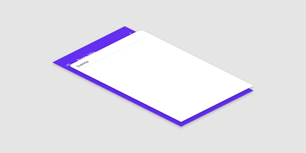
백드롭이란 (아래 그림과 같이) 기존의 스크린 위에 새로운 화면이 뜨는 방식의 UI를 뜻합니다. 인스타그램의 프로필 스크린에서 프로필 이름을 누르거나, 옵션을 누를 때 아래에서 올라오는 스크린을 말하는 것이죠. 아래에서 올라오는 화면이라는 의미로 바텀 시트라고 부르기도 합니다.
방법1: 라이브러리 활용하기
새로운 기능을 써야할 때 가장 편리한 방법은 라이브러리를 활용하는 것입니다. 검색하다가 몇가지 라이브러리를 찾을 수 있었는데요. 제공하는 기능도 많고 좋아보였는데, 다운로드 수가 적은 것이 조금 걱정이더라고요.
- react-native-gesture-bottom-sheet
- react-native-raw-bottom-sheet
만약 스크롤 유무 등을 선택할 수 있는 다양한 형태의 백드롭을 활용한다면 라이브러리를 활용하는 것을 추천드립니다. 다만 저는 스크롤 없이 열렸다 닫히는 백드롭만 사용할 예정이라서, 라이브러리를 활용하지 않고 직접 개발했습니다.
방법2: 직접 개발하기
아래는 스크롤 기능은 빼고, 하단에서 스르륵 올라왔다가 내려가는 애니메이션이 추가된 백드롭 컴포넌트입니다. 백드롭이 생성되었을 때 배경화면을 얼마나 흐리게 할 것인지 등은 아래 style에서 직접 설정하시면 됩니다!
import React, {
  ReactNode,
  useCallback,
  useEffect,
  useMemo,
  useRef,
  useState
} from 'react'
import {
  Animated,
  BackHandler,
  Dimensions,
  LayoutChangeEvent,
  Pressable,
  StyleProp,
  StyleSheet,
  View,
  ViewStyle
} from "react-native"

interface BackdropProps {
  visible: boolean
  children: ReactNode
  onClickClose?: () => void
  afterOpen?: () => void
  afterClose?: () => void
  closeOnBackButton?: boolean
  backdropStyle?: StyleProp<ViewStyle>
  containerStyle?: StyleProp<ViewStyle>
}

const { height } = Dimensions.get('window');

const Backdrop = ({
  visible,
  children,
  onClickClose = () => {},
  afterOpen = () => {},
  afterClose = () => {},
  closeOnBackButton = false,
  backdropStyle = {},
  containerStyle = {}
}: BackdropProps) => {
  const [contentHeight, setContentHeight] = useState(0);
  const transitionY = useRef(new Animated.Value(height));
  const animationConfig = {
    useNativeDriver: true,
    duration: 50,
    speed: 14,
    bounciness: 4,
  }

  const animationStart = useCallback(() => {
    Animated.spring(
      transitionY.current,
      {
        toValue: 0,
        ...animationConfig,
      }
    ).start(() => afterOpen());
  }, [afterOpen]);

  const animationEnd = useCallback(() => {
    Animated.spring(
      transitionY.current,
      {
        toValue: contentHeight,
        ...animationConfig,
      }
    ).start(() => afterClose());
  }, [contentHeight, afterClose]);

  const onLayout = (event: LayoutChangeEvent) => {
    if (!contentHeight || !visible) {
      transitionY.current.setValue(event.nativeEvent.layout.height);
      setContentHeight(event.nativeEvent.layout.height);
    }
  };

  const clampedTransition = useMemo(
    () =>
      transitionY.current.interpolate({
        inputRange: [0, contentHeight || 1],
        outputRange: [
          contentHeight > height ? contentHeight - height : 0,
          contentHeight || 1,
        ],
        extrapolate: 'clamp',
      }),
    [contentHeight],
  );

  const clampedOpacity = useMemo(
    () =>
      transitionY.current.interpolate({
        inputRange: [0, contentHeight || 1],
        outputRange: [1, 0],
        extrapolate: 'clamp',
      }),
    [contentHeight],
  );

  const clampedContentOpacity = useMemo(
    () =>
      transitionY.current.interpolate({
        inputRange: [
          0,
          contentHeight ? contentHeight / 1.1 : 0.95,
          contentHeight || 1,
        ],
        outputRange: [1, 1, 0],
        extrapolate: 'clamp',
      }),
    [contentHeight],
  );

  const handleClose = () => {
    onClickClose()
    return true
  }

  useEffect(() => {
    if (visible) {
      animationStart()
    } else {
      animationEnd()
    }
  }, [visible, animationStart, animationEnd]);

  useEffect(() => {
    if (closeOnBackButton) {
      BackHandler.addEventListener('hardwareBackPress', handleClose);
    }

    return () => {
      if (closeOnBackButton) {
        BackHandler.removeEventListener('hardwareBackPress', handleClose);
      }
    }
  }, [closeOnBackButton, handleClose]);

  return (
    <View pointerEvents="box-none" style={styles.wrapper}>
      <Animated.View
        style={[
          styles.overlayStyle,
          backdropStyle,
          {
            opacity: clampedOpacity,
          },
        ]}
        pointerEvents={visible ? 'auto' : 'none'}
      >
        <Pressable
          style={styles.overlayTouchable}
          onPress={handleClose}
        />
      </Animated.View>

      <Animated.View
        pointerEvents="box-none"
        accessibilityLiveRegion="polite"
        style={[
          styles.contentContainer,
          {
            transform: [
              {
                translateY: clampedTransition,
              },
            ],
            opacity: clampedContentOpacity,
          },
        ]}>
        <View
          style={containerStyle}
          onLayout={onLayout}
        >
          {children}
        </View>
      </Animated.View>
    </View>
  )
}

const styles = StyleSheet.create({
  wrapper: {
    position: 'absolute',
    left: 0,
    right: 0,
    top: 0,
    bottom: 0,
    zIndex: 100,
    elevation: 10,
    justifyContent: 'flex-end',
    flex: 1,
  },
  overlayTouchable: {
    flex: 1,
  },
  contentContainer: {
    flex: 1,
    justifyContent: 'flex-end',
  },
  overlayStyle: {
    position: 'absolute',
    left: 0,
    right: 0,
    top: 0,
    bottom: 0,
    backgroundColor: 'rgba(0, 0, 0, 0.5)'
  },
})

export default Backdrop
그리고 이러한 Backdrop 컴포넌트를 이용할 때에는 아래와 같이 컴포넌트를 import하여 내부에 원하는 형태의 컴포넌트를 구성하면 됩니다. (그리고 뒤로가기를 눌렀을 때 닫히게 만들고 싶은 경우가 많아서 closeOnBackButton props도 추가하였습니다)
import React, { useState } from 'react'
import {
  View,
  Pressable,
  Text
} from 'react-native'
import Backdrop from 'src/components/Backdrop' // 컴포넌트를 만든 경로에서 import

const TestScreen = () => {
  const [isBackdropOpened, setIsBackdropOpened] = useState(false)

  return (
    <View>
      <Pressable onPress={() => setIsBackdropOpened(true)}>
      	<Text>백드롭 열기</Text>
      </Pressable>

      <Backdrop
      	visible={isBackdropOpened}
        onClickClose={() => setIsBackdropOpened(false)}
        closeOnBackButton
        containerStyle={{ backgroundColor: '#ffffff' }}
      >
        <View>
          <Text>
            짜잔!
          </Text>
        </View>
      </Backdrop>
    </View>
  )
}

export default TestScreen
오늘은 백드롭 구현에 대해 한 번 살펴보았는데요. 콘텐츠가 도움이 되었길 바라며, 그럼 오늘도 모두들 해피코딩하세요 :)